
Power of 6 Color Schemes : As a designer, understanding the six color schemes of art is crucial to creating captivating and harmonious designs.
In this article, we explore the different color schemes and how they can be used to enhance your design projects.
Colors have a significant impact on the emotions and feelings of people. As a designer, it is essential to understand how to use color to create a visual experience that evokes emotions and communicates a message.
download pdfIntroducing 6 Color Schemes of Art for Designers
The six color schemes of art are a fundamental aspect of color theory that every designer should be familiar with. They are used to create harmonious, balanced, and visually appealing designs. In this article, we will dive into the six color schemes of art and how to use them in your designs.
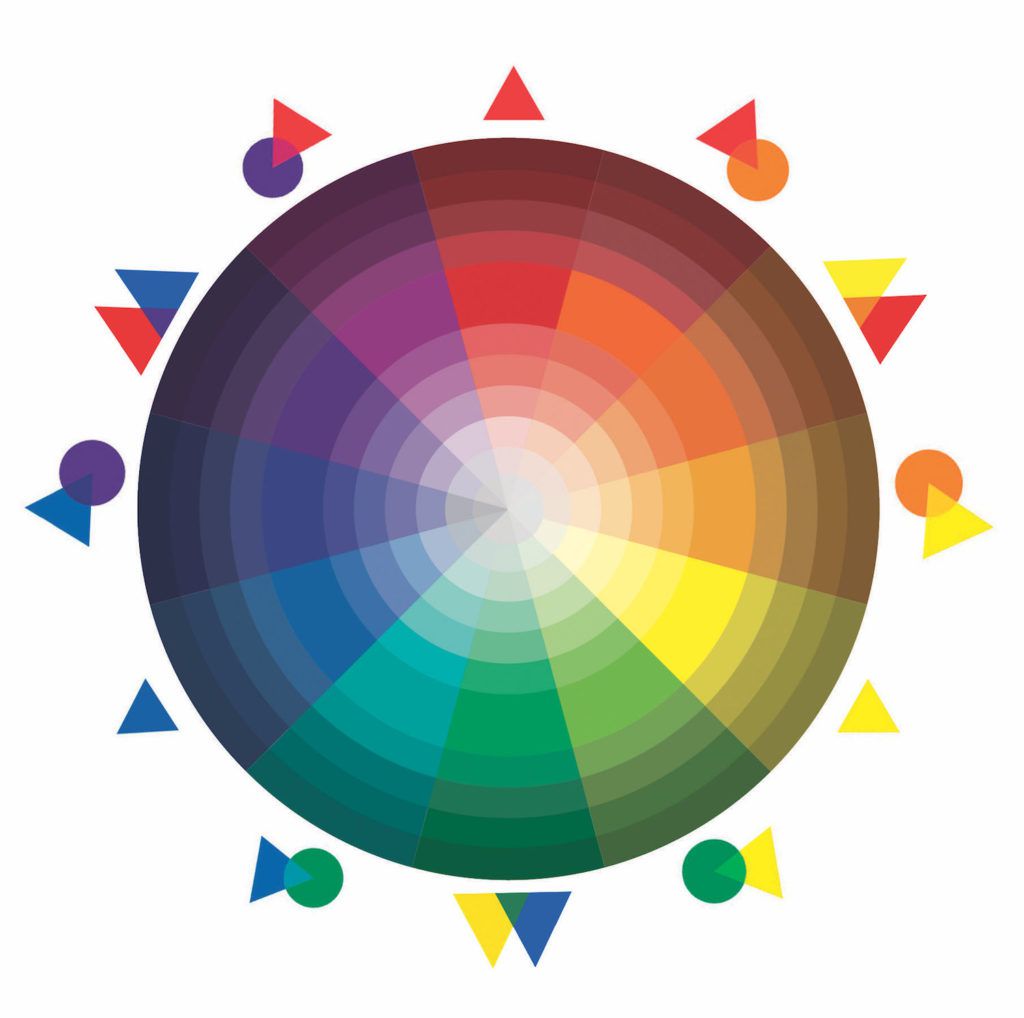
- A monochromatic color scheme consists of using only one color and its different shades and tints.
- Analogous color schemes are made up of colors that are adjacent to each other on the color wheel.
- Complementary color schemes consist of using colors that are opposite each other on the color wheel.
- Triadic color schemes are created by using three colors that are evenly spaced on the color wheel.
- Split complementary color schemes use a base color and two colors adjacent to its complement.
- Tetradic color schemes consist of using two complementary pairs of colors.
Let’s understand 6 Color Schemes of Art for Designers
As a designer, you know how important color is in creating a visually appealing design. Color schemes can make or break your design, and selecting the right color palette can be challenging. In this article, we will explore six color schemes of art that can help you create stunning designs.
Monochromatic Color Scheme
The monochromatic color scheme is based on a single hue with different shades and tints. This scheme is easy to create and provides a harmonious look to the design. You can choose any hue, and then use its variations to create a monochromatic color scheme. For example, if you choose blue, you can use navy, sky blue, and baby blue to create a cohesive design.
Analogous Color Scheme
Analogous color scheme uses colors that are adjacent to each other on the color wheel. These colors usually have a similar hue, and they create a cohesive and harmonious look in the design. You can use this color scheme to create a subtle and sophisticated design. For example, you can use shades of blue, green, and purple to create an analogous color scheme.
Complementary Color Scheme
Complementary color scheme uses colors that are opposite each other on the color wheel. These colors provide a high-contrast look to the design and create a bold and eye-catching design. You can use this color scheme to create a design that pops. For example, you can use yellow and purple or red and green to create a complementary color scheme.
Triadic Color Scheme
The triadic color scheme uses three colors that are evenly spaced on the color wheel. This color scheme creates a vibrant and dynamic look in the design. You can use this color scheme to create a design that is bold and playful. For example, you can use orange, green, and purple to create a triadic color scheme.
Tetradic Color Scheme
The tetradic color scheme uses four colors that are two pairs of complementary colors. This color scheme provides a lot of variety in the design and allows you to create a complex and sophisticated look. You can use this color scheme to create a design that is rich and balanced. For example, you can use blue, green, orange, and red to create a tetradic color scheme.
Split-Complementary Color Scheme
The split-complementary color scheme uses one color and two colors that are adjacent to its complementary color. This color scheme provides a balance between contrast and harmony in the design. You can use this color scheme to create a design that is eye-catching and unique. For example, you can use red, yellow-green, and blue-green to create a split-complementary color scheme.
Key Takeaway!
In conclusion, understanding the six color schemes of art is essential to creating visually appealing and harmonious designs. Each color scheme has its unique characteristics, and choosing the right one can enhance the message you want to communicate. Experiment with different color schemes and create designs that evoke emotions and leave a lasting impression on your audience. The six color schemes of art for designers are an essential aspect of design, and incorporating them into your work can take your designs to the next level.
6 color schemes of art for designers: FAQs
Q: Can I use more than one color scheme in a design? A: Yes, you can use more than one color scheme in a design. However, it’s essential to ensure that the colors work well together and create a harmonious design.
Q: How do I know which color scheme to use in my design? A: The color scheme you choose will depend on the message you want to communicate and the emotions you want to evoke. For example, if you want to create a calm and peaceful design, a monochromatic or analogous color scheme may be suitable.
Q: How can I use color schemes to enhance my branding? A: Using a consistent color scheme in your branding can help create a recognizable and memorable brand. You can choose a color scheme that represents your brand’s values and personality.
(Disclaimer: GFI and GFI Team is updating knowledgeable content in this blog from official sources and is not aiming to promote any particular source or business through this and also, do not hold any copyrighting rights under our names for the content)