


A Graphic Designer: The guidelines for the nine design principles that a graphic designer must follow in order to produce a successful and appealing composition are explained here, along with tips on how to use them.
The basic design principles are emphasis, balance, pattern, contrast, repetition, proportion, movement, harmony and variety. In contrast to art, design must serve a purpose. This feature is demonstrated by including a focal point or center of interest in an image.
‘But wait!’ you may exclaim. ‘I thought the point of the design was to be creative?’ If you’re a new entrepreneur or designer, you might just be tempted to go all out and combine the first five typefaces and colors that catch your eye in the hopes of creating something one-of-a-kind. You will almost certainly end up with a disorganized design.
Graphic design, like any other discipline, adheres to strict guidelines that work beneath the surface to keep the work balanced and consistent. If that balance is missing, the design will be poor and useless. This article will walk you through the key design principles that will distinguish your next project.
This blog covers all the pin-points related to design principles till the end but if you want to explore more about it through visuals do check out this presentation on “The 9 design principles for designers.”
Download PDFBALANCE
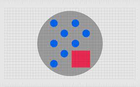
The key word here is balance. It creates a sense of equivalence across a canvas.
Visual weight is given to typography, colors, images, shapes, patterns, and other design elements. Some elements are more visible and draw the eye, while others are more subtle. The arrangement of these items on a page should appear balanced. When it comes to design balance, there are three options: symmetrical, asymmetrical, and radial.
- Symmetrical balance: equal weight for elements on both sides of the centerline.
- Asymmetrical balance occurs when the sides have opposite weights but appear balanced.
- Radial balance: your design’s elements are arranged around the central point.
EMPHASIS
Emphasis attracts attention. It emphasises key points and makes them stand out.
The emphasis of a design is the focal point and the order of importance of each element within a design. Consider creating a concert poster. What is the most critical piece of information that my audience should be aware of? Make a mental map of your situation. Allow your brain to organise the data before you start designing. If the band’s name is the most important piece of information, centre it or make it the poster’s focal point.
If you begin your composition without a clear idea of what you want to say, Principles for Graphic Designers will fail, just as writing without an outline as well as building without a blueprint will.
MOVEMENT
The eye is directed by movement. It directs users to the design’s focal point.
The movement Principles for Graphic Designers is concerned with your eye’s perception of flow or movement as it moves across the work. Even a pattern made entirely of squares has the ability to move. Principles for Graphic Designers all depends on how the squares are used, their size, and their location. Some woven fabrics are more prone to movement than others.
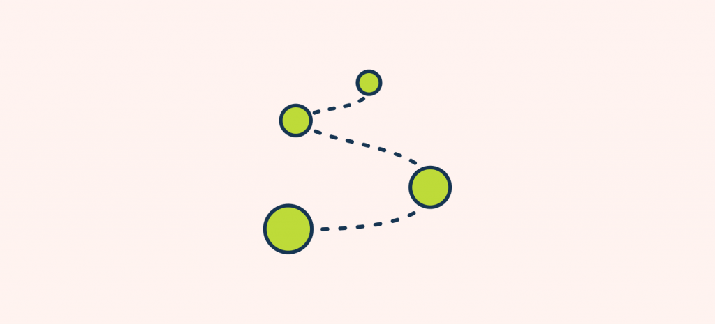
When creating a wall hanging, you’ll want the viewer’s gaze to move across the piece without missing any details or becoming stuck in one spot. Clothing, table runners, book covers, and tote bags are optional. The movement on these goods could be enjoyable and interesting.
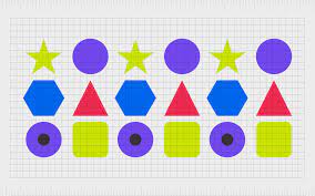
PATTERN
The pattern creates the path. It creates familiarity and organises design for easy viewing.
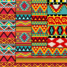
In Graphic Design, a pattern is the repetition of multiple graphic elements on your design that work together to create an eye-catching and harmonious design. The pattern principle refers to how design elements in a project are designed and set a standard to easily communicate your ideas.
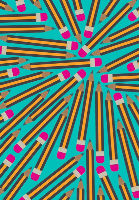
REPETITION
Design becomes more conscious as a result of repetition. It improves the design’s consistency and flow.
If you stick to two or three strong typefaces or colours, you’ll quickly notice that some elements are repeated. That’s fine! Repetition is frequently believed to unify and reinforce a design. Only if one thing on your band poster is in blue italic sans-serif, Principles for Graphic Designers may appear to be a mistake. If three things are in blue italic sans-serif, you’ve created a motif and regained control of your design.
Beyond a single printed product, repetition is essential. Beautiful graphic patterns are common in today’s packaging design. Anyone thinking about starting a business knows that one of the first things they’ll need is a great logo to use on their website, business cards, social media, and other marketing materials.
PROPORTION
Proportion communicates stability. It entails scaling various elements to create a unified design.
Proportion is an art design theory that describes the relationship between two or more parts in a composition and also how they compare to one another in terms of size, colour, quantity, degree, location, and so on; it is also referred to as a ratio.
Principles for Graphic Designers is in the size connection that the proportional principle is applied to a work of art. This is the ratio of the size of one element in a composition to the size of another related component. In this case, the comparison is between:
- Size of one location in relation to another
- one element’s size to another’s size
- the distance between two or more items
- one element’s height, width, and depth and another’s
HARMONY
Harmony brings elements closer together. It highlights the familiar characteristics of design elements.
Harmony in a painting or design contributes to unity. However, all harmony and no contrast can become monotonous. It is necessary to strike a balance between areas of harmony and areas of contrast. Harmony is the visually pleasing result of combining elements that are similar or related.
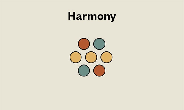
- Adjacent colors
- Similar shapes
- Related textures
CONTRAST
Contrast is concerned with conflict. It emphasizes the distinction and emphasises what is important.
Clients who insist that a design “pop” are one of the most common problems designers face when it comes to client feedback. While that may appear to be an arbitrary term, the customer is implying that more contrast is required in the design.
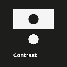
The relationship between different elements in a design, particularly nearby elements, is referred to as contrast. As a result of these differences, various elements stand out. Contrast is also important in creating accessible designs. Understanding contrast is essential if you want to work with type because it implies that the weight and size of your type are balanced.
VARIETY
Variety attracts attention. It gives the design flavour, making it more interesting and engaging.
You need variety to create visual interest and keep the viewer’s attention for a longer period of time. Variety is the use of multiple design elements to make your art “explorable” and provide a better experience for the viewer. However, you do not have to demonstrate variety simply because it is required in your design. Principles for Graphic Designers should be organic and form an aesthetically pleasing composition. Colors, shapes, images, different typefaces, and other design elements can all be used to demonstrate variety.
How to Use the Design Principles
Now that you’ve learned the fundamentals of design, it’s time to put them into action. However, keep in mind that you do not have to adhere to all of these principles in order to create a groundbreaking design. You can skip one or two (or even more) design principles and elements if you’re confident that your design’s purpose will be met in the best possible way and that your message will reach your target audience.
Here are some quick tips to help you create a beautiful design while adhering to some key principles for your next composition:
- Choose colours based on colour psychology and create a colour contrast that is appropriate for your brand.
- Work with grids at all stages of your design to achieve amazing results.
- White or negative space is an important design element. You can even use it in conjunction with a simple colour to create logos.
- Bring in some variations while keeping the elements important to your brand in mind when using repetition and patterns. Without variation, your designs will become boring to your audience and will all look the same.
- Avoid having too much going on in your design so that the information or message you want to convey to your audience is not lost.
- A glitch effect can be used to add movement to your designs.
Winding up!
Design principles help to keep important ideas at the forefront of the design process. When properly constructed and implemented, design principles promote consistency in decision-making across designers as well as teams, eliminating the need to discuss simple tradeoffs as well as allowing designers to focus on more difficult issues.
These principles act as building blocks, providing your design with not only balance and emphasis, but also harmony and variety. These are some of the most important aesthetics that will be discussed in this article in order to make your design stand out in the eyes of your viewers.
(Disclaimer: Green Frog Interactive Team is updating knowledgeable content in this blog from official sources and is not aiming to promote any particular source or business through this and also, do not hold any copyrighting rights under our names for the content)


