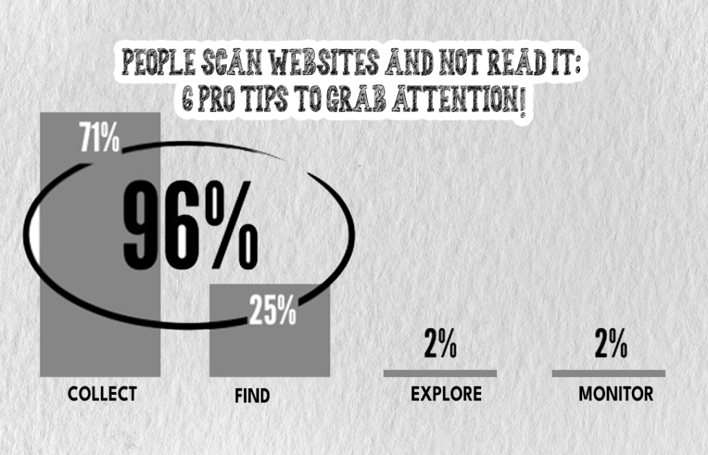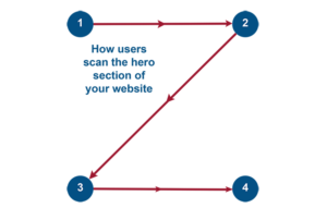
People Scan Websites: In today’s fast-paced digital world, people don’t have the time or patience to read through long paragraphs of text on a website. Instead, they scan it to quickly find the information they’re looking for.
This scanning behavior is deeply ingrained in our brains, and it’s crucial for website designers and content creators to understand it if they want to create a user-friendly website that engages their audience.

People Scan Websites: Our Brain is a Scanner
Our brains are wired to scan for information, not read it. When we encounter a new piece of information, our brains try to quickly categorize it based on its relevance and importance to us. This is called “scanning behavior” or “information foraging,” and it’s a survival mechanism that evolved over millions of years to help us efficiently gather and process information in our environment.
Importance of Content Placement
To design for scanning behavior, it’s important to place your content in a way that’s easy to scan. This means breaking up large blocks of text into smaller paragraphs, using bullet points and numbered lists, and highlighting important information using bold or italicized text. You can also use images, infographics, and videos to help break up the text and provide visual interest.
Role of First Fold of Web Page
The first fold of your web page – the area that’s visible without scrolling – is the most important part of your website. This is because people make quick judgments about the relevance and usefulness of a website based on what they see in this area. To capture their attention, it’s important to place your most important content and calls to action in this area.
Give them a Solid Reason to Scroll Down
To encourage people to scroll down your website, you need to give them a solid reason to do so. This can be done by using attention-grabbing headlines and subheadings that hint at the information that’s available below, or by using interactive elements like quizzes, polls, or surveys that require scrolling to participate in.
Attractive Headings and Subheadings
Headings and subheadings are critical for guiding people’s attention and helping them quickly understand the structure of your content. To be effective, your headings and subheadings should be clear, concise, and descriptive. They should also use keywords that are relevant to your content and help people quickly understand what your website is about.
Only 3 Seconds to Grab Attention!
Studies have shown that people spend an average of just 3 seconds on a website before deciding whether to stay or leave. This means you need to make a strong first impression and immediately communicate the value of your website. This can be done using attention-grabbing headlines, high-quality images, or interactive elements that engage people’s curiosity and encourage them to explore further.
Conclusion
In conclusion, people don’t read websites, they scan them. To design for scanning behavior, it’s important to understand how our brains process information and to use design and content strategies that make it easy for people to quickly find the information they’re looking for.
By using attention-grabbing headlines and subheadings, breaking up large blocks of text, and placing your most important content in the first fold of your website, you can create a user-friendly website that engages your audience and encourages them to explore further.
FAQs:
Q. Is scanning behavior limited to websites?
A. No, scanning behavior is not limited to websites. It’s a common human behavior that we use to quickly gather information in many different contexts.
Q. How can I design a website that’s easy to scan?
A. To design a website that’s easy to scan, you can use design and content strategies like breaking up large blocks of text, using bullet points, and numbered
Q. How can I ensure my website’s content is scannable for users with different levels of reading ability?
A. To ensure your website’s content is scannable for users with different levels of reading ability, you can use plain language, avoid jargon, and use short sentences and simple language. You can also use descriptive headings and subheadings, and use visual aids like images and videos to help convey your message.
Q. How do I measure the effectiveness of my website’s design for scanning behavior?
A. To measure the effectiveness of your website’s design for scanning behavior, you can use tools like Google Analytics to track user behavior, including bounce rate, time spent on a page, and click-through rate. You can also conduct user testing and surveys to gather feedback and identify areas for improvement.
Q. What are some common mistakes to avoid when designing for scanning behavior?
A. Some common mistakes to avoid when designing for scanning behavior include using long paragraphs of text, using a small font size or font style that’s difficult to read, and using too many distracting or irrelevant images. It’s also important to avoid using too much jargon or technical language that may be difficult for users to understand.
(Disclaimer: GFI and GFI Team are updating knowledgeable content in this blog from official sources and are not aiming to promote any particular source or business through this and also, do not hold any copyrighting rights under our names for the content)


